> ## Documentation Index
> Fetch the complete documentation index at: https://prismeai-legacy.mintlify.site/llms.txt
> Use this file to discover all available pages before exploring further.
# Overview
> Build reusable UI components that communicate through events in the AI Builder framework
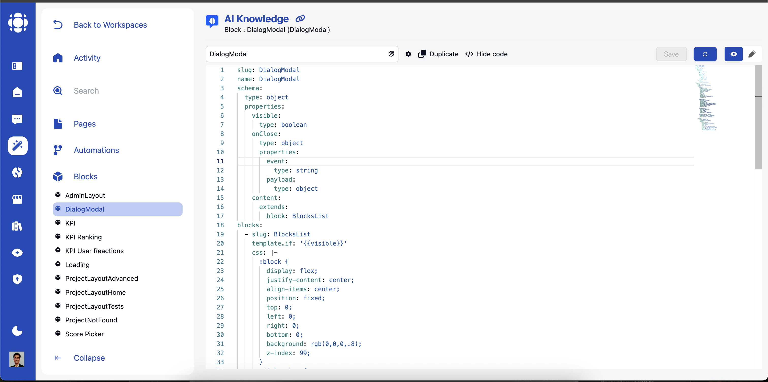 Blocks are reusable UI components that serve as the building blocks for creating interactive interfaces in AI Builder. They encapsulate functionality, emit and listen for events, and can be assembled to create complete user experiences.
## Block Fundamentals
Blocks are modular UI components with specific purposes:
* **Self-contained**: Each block encapsulates specific functionality
* **Reusable**: Can be used across multiple pages and workspaces
* **Configurable**: Customizable through properties and settings
* **Interactive**: Respond to user actions and system events
* **Event-driven**: Communicate with other components through events
Blocks follow the [BlockProtocol.org](https://blockprotocol.org) standard, ensuring consistency and interoperability.
AI Builder provides several categories of blocks:
* **Built-in Blocks**: Core components provided by the platform
* **Apps Store Blocks**: Components from installed Apps provided by Prisme.ai
* **Template Blocks**: Pre-configured blocks within your workspaces for specific use cases
* **Custom Blocks**: Your own blocks created from the design system published on the App store
Each type serves different purposes in your application.
Blocks communicate through an event-driven model:
* **Event Emission**: Blocks emit events when something happens
* **Event Listening**: Blocks listen for events from other components
* **Data Exchange**: Events carry payloads with information
* **Asynchronous Communication**: Non-blocking interaction pattern
This communication model enables loose coupling between components.
## Common Block Properties
All blocks share a set of common properties that can be configured in YAML:
Required. Unique identifier for the block in your workspace.
```yaml theme={null}
# Page/Block
- slug: RichText
content: Hello world
```
Event fired when the block is initialized. Example: `myInitBlockEvent`
```yaml theme={null}
# Page/Block
- slug: RichText
onInit: init my content
```
```yaml theme={null}
# Automation
when:
events:
- init my content
```
Event that triggers an update of the block. Example: `myUpdateBlockEvent`
```yaml theme={null}
# Page/Block
- slug: RichText
onInit: init my content
updateOn: update my content
content: '{{text}}
```
```yaml theme={null}
# Automation
when:
events:
- init my content
do:
- emit:
event: update my content
payload:
text: Hello world
```
Init the block with an automation as endpoint. Example: `myAutomation`
The difference with the event base init is that the automation will take query string in `{{body}}`
and the output will be used to upgrade the block. No need to emit an update event and to listen to
a `updateOn` event.
```yaml theme={null}
# Page/Block
- slug: RichText
automation: init my content
content: '{{text}}
```
```yaml theme={null}
# Automation
slug: init my content
output:
text: Hello world
```
CSS class name to apply to the block. Example: `block-classname`
Custom CSS for styling the block.
There is some private keywords to help you target your element:
`:block` is a shortcut to the unique generated class of your block. Use it to target the root of your block DOM.\
Every selector you set will be automatically prexifed by `:block` to avoid polluting the page styles.
You will need to use :block specifically if you set a dynamic stated class on your block:
```yaml theme={null}
- slug: RichText
content: Hello world
className: 'status-{{item.status}}'
css: |-
:block {
background: white;
}
:block.status-closed {
background: red;
}
```
When you set css, it override the default styles of the block. But maybe you
just want to keep the styles but add only something. You will use `@import default`:
```yaml theme={null}
- slug: TabsView
css: |-
@import default;
.pr-block-tabs-view__tab {
background: red;
}
```
Finally, you may want to set styles on an element external to your block.
You can target outside it by using `:root`:
```yaml theme={null}
- slug: RichText
css: |-
:root a {
color: red; // All links in the page will be red.
}
```
Conditional display expression. Block will only be shown if the expression evaluates to true.
```yaml theme={null}
- slug: RichText
template.if: '{{textIsVisible}}'
```
Allows repeating the block for each item in an array.
```yaml theme={null}
- slug: RichText
template.repeat:
on: '{{items}}'
as: item
blocks:
- slug: RichText
content: '{{item.text}}'
```
## Built-in Blocks Library
AI Builder includes a comprehensive library of built-in blocks. Here's a detailed reference for each block with its specific YAML configuration.
* [BlocksList](./blocks/BlocksList)
* [RichText](./blocks/RichText)
* [Image](./blocks/Image)
* [Button](./blocks/Button)
* [Icon](./blocks/Icon)
* [Form](./blocks/Form)
* [TabsView](./blocks/TabsView)
* [Action](./blocks/Action)
* [DataTable](./blocks/DataTable)
* [TimeList](./blocks/TimeList)
## Marketplace Blocks
The following blocks are available after installing specific apps from the marketplace.
* [Charts](./blocks-tierce/Charts)
* [Popover](./blocks-tierce/Popover)
## Next Steps
Learn how to combine blocks into complete user interfaces
Explore backend logic that interacts with blocks
Understand the underlying architecture of AI Builder
See examples of blocks in real-world applications
Blocks are reusable UI components that serve as the building blocks for creating interactive interfaces in AI Builder. They encapsulate functionality, emit and listen for events, and can be assembled to create complete user experiences.
## Block Fundamentals
Blocks are modular UI components with specific purposes:
* **Self-contained**: Each block encapsulates specific functionality
* **Reusable**: Can be used across multiple pages and workspaces
* **Configurable**: Customizable through properties and settings
* **Interactive**: Respond to user actions and system events
* **Event-driven**: Communicate with other components through events
Blocks follow the [BlockProtocol.org](https://blockprotocol.org) standard, ensuring consistency and interoperability.
AI Builder provides several categories of blocks:
* **Built-in Blocks**: Core components provided by the platform
* **Apps Store Blocks**: Components from installed Apps provided by Prisme.ai
* **Template Blocks**: Pre-configured blocks within your workspaces for specific use cases
* **Custom Blocks**: Your own blocks created from the design system published on the App store
Each type serves different purposes in your application.
Blocks communicate through an event-driven model:
* **Event Emission**: Blocks emit events when something happens
* **Event Listening**: Blocks listen for events from other components
* **Data Exchange**: Events carry payloads with information
* **Asynchronous Communication**: Non-blocking interaction pattern
This communication model enables loose coupling between components.
## Common Block Properties
All blocks share a set of common properties that can be configured in YAML:
Required. Unique identifier for the block in your workspace.
```yaml theme={null}
# Page/Block
- slug: RichText
content: Hello world
```
Event fired when the block is initialized. Example: `myInitBlockEvent`
```yaml theme={null}
# Page/Block
- slug: RichText
onInit: init my content
```
```yaml theme={null}
# Automation
when:
events:
- init my content
```
Event that triggers an update of the block. Example: `myUpdateBlockEvent`
```yaml theme={null}
# Page/Block
- slug: RichText
onInit: init my content
updateOn: update my content
content: '{{text}}
```
```yaml theme={null}
# Automation
when:
events:
- init my content
do:
- emit:
event: update my content
payload:
text: Hello world
```
Init the block with an automation as endpoint. Example: `myAutomation`
The difference with the event base init is that the automation will take query string in `{{body}}`
and the output will be used to upgrade the block. No need to emit an update event and to listen to
a `updateOn` event.
```yaml theme={null}
# Page/Block
- slug: RichText
automation: init my content
content: '{{text}}
```
```yaml theme={null}
# Automation
slug: init my content
output:
text: Hello world
```
CSS class name to apply to the block. Example: `block-classname`
Custom CSS for styling the block.
There is some private keywords to help you target your element:
`:block` is a shortcut to the unique generated class of your block. Use it to target the root of your block DOM.\
Every selector you set will be automatically prexifed by `:block` to avoid polluting the page styles.
You will need to use :block specifically if you set a dynamic stated class on your block:
```yaml theme={null}
- slug: RichText
content: Hello world
className: 'status-{{item.status}}'
css: |-
:block {
background: white;
}
:block.status-closed {
background: red;
}
```
When you set css, it override the default styles of the block. But maybe you
just want to keep the styles but add only something. You will use `@import default`:
```yaml theme={null}
- slug: TabsView
css: |-
@import default;
.pr-block-tabs-view__tab {
background: red;
}
```
Finally, you may want to set styles on an element external to your block.
You can target outside it by using `:root`:
```yaml theme={null}
- slug: RichText
css: |-
:root a {
color: red; // All links in the page will be red.
}
```
Conditional display expression. Block will only be shown if the expression evaluates to true.
```yaml theme={null}
- slug: RichText
template.if: '{{textIsVisible}}'
```
Allows repeating the block for each item in an array.
```yaml theme={null}
- slug: RichText
template.repeat:
on: '{{items}}'
as: item
blocks:
- slug: RichText
content: '{{item.text}}'
```
## Built-in Blocks Library
AI Builder includes a comprehensive library of built-in blocks. Here's a detailed reference for each block with its specific YAML configuration.
* [BlocksList](./blocks/BlocksList)
* [RichText](./blocks/RichText)
* [Image](./blocks/Image)
* [Button](./blocks/Button)
* [Icon](./blocks/Icon)
* [Form](./blocks/Form)
* [TabsView](./blocks/TabsView)
* [Action](./blocks/Action)
* [DataTable](./blocks/DataTable)
* [TimeList](./blocks/TimeList)
## Marketplace Blocks
The following blocks are available after installing specific apps from the marketplace.
* [Charts](./blocks-tierce/Charts)
* [Popover](./blocks-tierce/Popover)
## Next Steps
Learn how to combine blocks into complete user interfaces
Explore backend logic that interacts with blocks
Understand the underlying architecture of AI Builder
See examples of blocks in real-world applications